
Site Theme
Multi-template Astro toolkit for landing pages, docs, product sites, portfolios, and SaaS dashboards
Ask AI about Site Theme
Powered by Claude · Grounded in docs
I know everything about Site Theme. Ask me about installation, configuration, usage, or troubleshooting.
0/500
Reviews
Documentation
日本語 | 中文 | Español | Français | हिन्दी | Italiano | Português (BR)
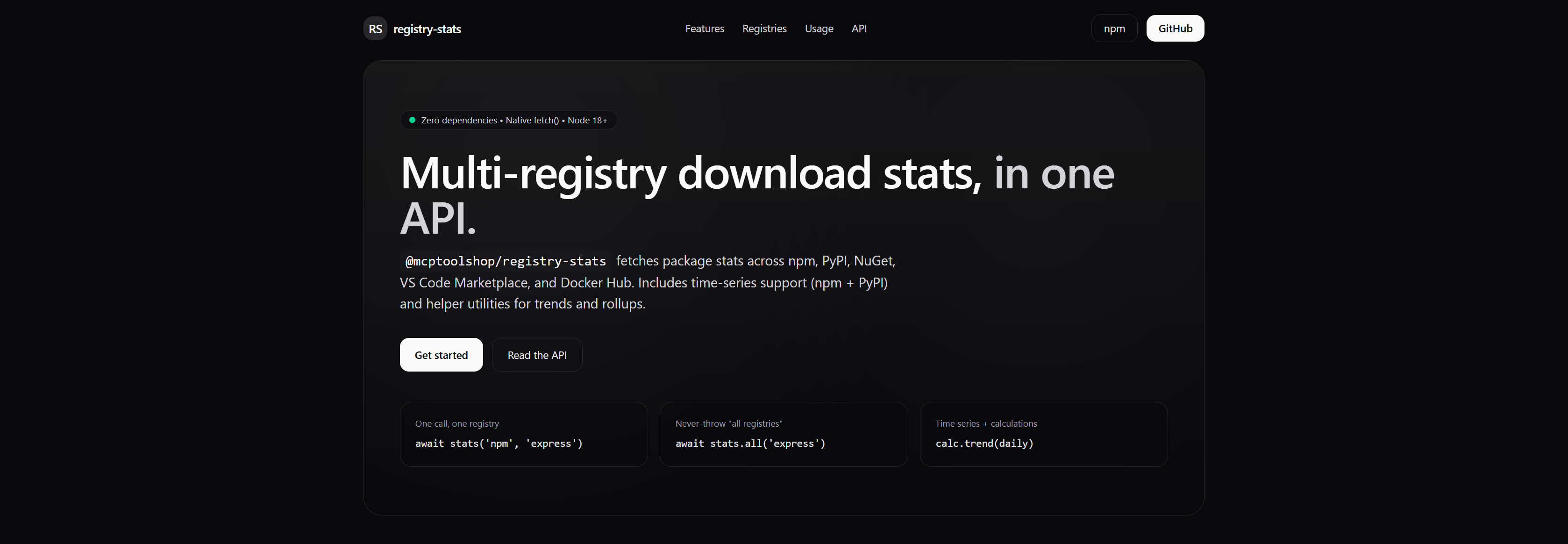
@mcptoolshop/site-theme
Multi-template Astro toolkit for landing pages, docs, product sites, portfolios, and SaaS dashboards.
Dark palette · Tailwind CSS v4 · GitHub Pages ready.

Templates · Quick Start · Design Tokens · Components · Deploy · License
Templates
Pick a template, scaffold, build. Every template ships CI-tested and GitHub Pages-ready.
| Template | Description | Pages |
|---|---|---|
| default | Project landing page with hero, features, and code examples | 1 |
| docs | Documentation site with sidebar navigation and content sections | 1 |
| product | Marketing landing page with pricing, testimonials, and CTAs | 1 |
| portfolio | Filterable catalog grid for tools, projects, or any collection | 1 |
| app | Multi-tenant SaaS dashboard with RBAC, feature flags, and workspace routing | 31 |
npx @mcptoolshop/site-theme list-templates            # see all options
npx @mcptoolshop/site-theme list-templates --json      # machine-readable output
npx @mcptoolshop/site-theme init --template app        # scaffold a template
npx @mcptoolshop/site-theme init --template app --dry-run   # preview files
npx @mcptoolshop/site-theme init --out ../other-repo   # scaffold into another directory
Quick Start
Scaffold a new site
npx @mcptoolshop/site-theme init
cd site && npm install
npm run dev
This creates a site/ directory with Astro + Tailwind + theme wired up, plus a GitHub Pages workflow. The CSS import, @source path, and base path are all pre-configured — no manual setup needed.
Edit your content
All page content lives in site/src/site-config.ts. Edit the config object to customize your landing page:
import type { SiteConfig } from '@mcptoolshop/site-theme';

export const config: SiteConfig = {
  title: '@mcptoolshop/my-tool',
  description: 'What my tool does.',
  logoBadge: 'MT',
  brandName: 'my-tool',
  repoUrl: 'https://github.com/mcp-tool-shop-org/my-tool',
  npmUrl: 'https://www.npmjs.com/package/@mcptoolshop/my-tool',
  footerText: 'MIT Licensed',

  hero: { /* ... */ },
  sections: [ /* ... */ ],
};
Design Tokens
The theme ships semantic design tokens via styles/theme.css. Components reference these tokens instead of hardcoded colors, so you can reskin the entire theme by overriding a few values.
Default tokens
| Token | Default | Used for |
|---|---|---|
--color-surface | #09090b | Page background |
--color-surface-raised | #18181b | Elevated elements, code blocks |
--color-surface-strong | #27272a | Badges, emphasized backgrounds |
--color-edge | #27272a | Primary borders |
--color-edge-subtle | #18181b | Card / table borders |
--color-heading | #fafafa | Headings, primary text |
--color-body | #e4e4e7 | Body / secondary text |
--color-muted | #d4d4d8 | Muted text |
--color-dim | #a1a1aa | Labels, descriptions |
--color-accent | #34d399 | Status indicators |
--color-action | #fafafa | Primary button background |
--color-action-text | #09090b | Primary button text |
--color-action-hover | #e4e4e7 | Primary button hover |
Customizing
Override any token in your site's global.css by adding a @theme block after the imports:
@import "tailwindcss";
@import "@mcptoolshop/site-theme/styles/theme.css";
@source "../../node_modules/@mcptoolshop/site-theme";

/* Override tokens */
@theme {
  --color-accent: #60a5fa;          /* blue status dot   */
  --color-surface: #0a0a1a;         /* navy background   */
  --color-action: #60a5fa;          /* blue buttons      */
  --color-action-hover: #3b82f6;
}
Tokens generate standard Tailwind v4 utilities (bg-surface, text-heading, border-edge, etc.) so you can also use them in your own components.
Components
Import components individually from the package:
---
import BaseLayout from '@mcptoolshop/site-theme/components/BaseLayout.astro';
import Hero from '@mcptoolshop/site-theme/components/Hero.astro';
import Section from '@mcptoolshop/site-theme/components/Section.astro';
import FeatureGrid from '@mcptoolshop/site-theme/components/FeatureGrid.astro';
import DataTable from '@mcptoolshop/site-theme/components/DataTable.astro';
import CodeCardGrid from '@mcptoolshop/site-theme/components/CodeCardGrid.astro';
import ApiList from '@mcptoolshop/site-theme/components/ApiList.astro';
import DocLayout from '@mcptoolshop/site-theme/components/DocLayout.astro';
import Sidebar from '@mcptoolshop/site-theme/components/Sidebar.astro';
import TableOfContents from '@mcptoolshop/site-theme/components/TableOfContents.astro';
import ContentSection from '@mcptoolshop/site-theme/components/ContentSection.astro';
import SocialProof from '@mcptoolshop/site-theme/components/SocialProof.astro';
import PricingGrid from '@mcptoolshop/site-theme/components/PricingGrid.astro';
import TestimonialGrid from '@mcptoolshop/site-theme/components/TestimonialGrid.astro';
import CtaBanner from '@mcptoolshop/site-theme/components/CtaBanner.astro';
import PortfolioGrid from '@mcptoolshop/site-theme/components/PortfolioGrid.astro';
import FilterBar from '@mcptoolshop/site-theme/components/FilterBar.astro';
---
The theme ships 17 Astro components across five categories: layout shells, content sections, marketing blocks, portfolio, and documentation.
BaseLayout
Full page shell with sticky header (logo badge, nav links, GitHub/npm buttons) and footer.
| Prop | Type | Description |
|---|---|---|
title | string | Page <title> |
description | string | Meta description |
logoBadge | string | 1–2 char badge (e.g. "RS") |
brandName | string | Name in header |
nav | { href, label }[] | Anchor nav links (optional, defaults to []) |
repoUrl | string | GitHub repo URL |
npmUrl? | string | npm package URL |
footerText | string | Footer text (HTML allowed) |
Hero
Gradient hero with status badge, headline, CTAs, and optional code preview cards.
| Prop | Type | Description |
|---|---|---|
badge | string | Status badge text |
headline | string | Main headline |
headlineAccent | string | Muted suffix |
description | string | Description (HTML allowed) |
primaryCta | { href, label } | Primary button |
secondaryCta | { href, label } | Secondary button |
previews | { label, code }[] | Code preview cards (optional) |
Section
Section wrapper with anchor id, heading, and optional subtitle.
FeatureGrid
3-column responsive card grid. Props: features: { title, desc }[]
DataTable
Grid-based bordered table. Props: columns: string[], rows: string[][]
CodeCardGrid
2-column grid of dark code block cards. Props: cards: { title, code }[]
ApiList
Full-width stacked API reference cards. Props: apis: { signature, description }[]
FilterBar
Client-side search + tag filtering bar for portfolio grids. Props: tags: string[], searchable?: boolean, searchPlaceholder?: string
PortfolioGrid
Configurable card grid with status badges, category grouping, and image/badge fallbacks. Props: items: PortfolioItem[], columns?: 2 | 3 | 4, groupByCategory?: boolean
DocLayout
Two-column layout with collapsible sidebar and main content area. Used by the docs template. Props: sidebar: SidebarGroup[], currentPath: string
Sidebar
Grouped navigation list with active-link highlighting. Props: groups: SidebarGroup[], currentPath?: string
TableOfContents
On-page heading navigation. Props: headings?: { text, id, depth }[]
ContentSection
Anchor-linked content block that renders HTML via set:html. Props: id: string, title: string, content: string
SocialProof
Stats bar with headline and value/label pairs. Props: headline?: string, stats?: { value, label }[]
PricingGrid
Responsive pricing tier cards with highlighted "Popular" tier. Props: tiers?: PricingTier[]
TestimonialGrid
Two-column quote cards with avatar fallback initials. Props: testimonials?: { quote, author, role, avatarUrl? }[]
CtaBanner
Full-width gradient call-to-action banner. Props: headline: string, description?: string, cta: { href, label }
Section Types
The sections array in your config supports these kind values:
| Kind | Component | Props |
|---|---|---|
features | FeatureGrid | features: { title, desc }[] |
data-table | DataTable | columns: string[], rows: string[][] |
code-cards | CodeCardGrid | cards: { title, code }[] |
api | ApiList | apis: { signature, description }[] |
Sections render in the order they appear in the array.
Deploy
The init CLI creates .github/workflows/pages.yml automatically. To go live:
- Push your repo to GitHub
- Go to your repo → Settings → Pages
- Under Build and deployment, set Source to GitHub Actions
- Push any change to
site/to trigger the first build
Your site will be live at https://<org>.github.io/<repo>/.
Security & Data Scope
| Aspect | Detail |
|---|---|
| Data touched | Astro component files, CSS tokens, site configuration — build time only |
| Data NOT touched | No user data, no runtime state, no server-side processing |
| Permissions | Read: project source files. Write: build output to site/dist/ |
| Network | None — static site generator with no runtime network access |
| Telemetry | None collected or sent |
HTML Props (set:html)
Several component props render raw HTML via Astro's set:html directive. If your data source is untrusted (user-generated content, external APIs), sanitize the HTML before passing it using a library like DOMPurify or sanitize-html.
| Component | Props using set:html |
|---|---|
| BaseLayout | footerText |
| Hero | badge, description |
| CodeCardGrid | cards[].code |
| ApiList | apis[].signature, apis[].description |
| ContentSection | content |
See SECURITY.md for vulnerability reporting.
Scorecard
| Category | Score |
|---|---|
| A. Security | 10 |
| B. Error Handling | 10 |
| C. Operator Docs | 10 |
| D. Shipping Hygiene | 10 |
| E. Identity (soft) | 10 |
| Overall | 50/50 |
Full audit: SHIP_GATE.md · SCORECARD.md
License
MIT
Built by MCP Tool Shop